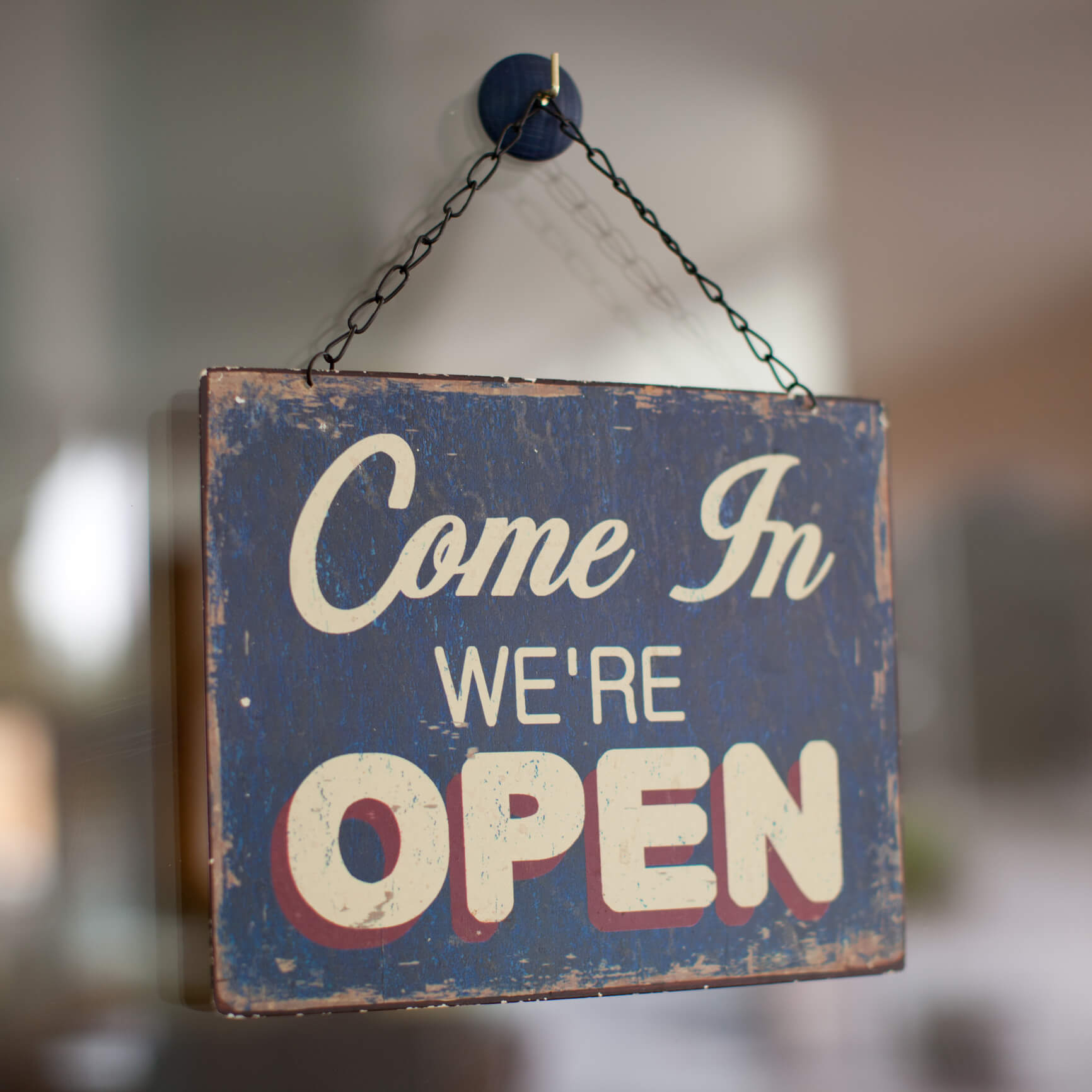
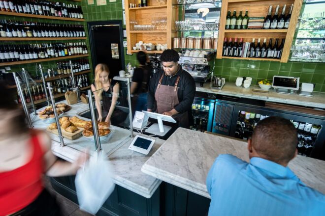
So, how can you keep things flowing smoothly through your store? One simple way is with in-store signage. Done correctly, in-store signage guides and informs your customers so they can, ideally, complete their transaction without having to ask a single question.
Here are 3 things to consider when creating perfect in-store signage:
1. How it looks
No matter what business you’re in, your goal is to offer the highest quality product or service. Your signage should reflect that same goal. Not only should it telegraph high quality, it should also be a natural extension of your brand. So, if you own a business that has a crafty and relaxed atmosphere, then look into creating a beautiful chalk board style sign. Or if your business is more upscale, create a sign consistent with that aesthetic, with clean lines and modern, simple design.
2. What it says
A great-looking sign with impossible-to-read text doesn’t do anyone any good. The text on your sign should be legible at a distance of 10+ feet. To this end, avoid whimsical, fancy fonts for the bulk of your copy.
Most importantly, be concise. Keep your text large and simple, direct the reader by using second-person words like “you” and “your,” and remember to include a call to action.
3. Where it lives
In short, where it resides is just as important as what it says. With that in mind, if you’re constantly receiving questions like “where’s your restroom?” or “where do I order?” or “what are today’s flavors?” then your in-store signage isn’t doing its job. When placing a sign in-store, you want to make sure your sign is visible in every area from which it might be addressed.
For example, in your ice cream shop, make sure your restroom sign is visible from the front door, the seating area, the register, and more. For a quick-serve restaurant, make sure your coffee and dessert menu is visible from your dining area so if a customer changes their mind post-meal, they can make a decision from their seat.
Secondly, it’s also important that you place signage directing your customers as soon as they enter your establishment. A confusing experience can be the impetus for that scathing review in the local paper or on Yelp. If you want them to sit down first, or order first, or wait to be seated, make sure they are told with signage.
In summary, be concise, be thoughtful about fonts and placement, make sure the style matches your store’s branding and look, and make sure what you say is appropriate for the audience.
And one last piece of advice: have fun. Great signage can make or break a store’s experience. Don’t be afraid to let the creative juices flow. You can even seek the expertise of a hired gun if you choose. Whatever path you take, make sure it’s your best shot. Your customers will appreciate it.


